![[Home]](https://ludism.org/logo/sclogo160.png)

The above isn't finished, but is presented singularly as a basis for other images..
Examples:
--Alex_Swavely?
Wow, Alex. This is a beautiful design. If it were not for one quibble I would vote for this to be our logo right away. The quibble is that the Geneva Convention explicitly forbids use of the red cross symbol for purposes other than medical facilities for Red Cross societies such as the American Red Cross, military chaplains, and treatment of wounded soldiers. The last thing I would like anybody to be able say about GamesToTheRescue is that it contravenes the Geneva Convention!
As I recall, we were talking on the mailing list about a logo featuring a friendly St. Bernard dog with an EmergencyGameKit instead of a cask of brandy around its neck. On the other hand, that's harder to draw, and might not be immediately recognisable to everyone, whereas your image could be easily translated across cultures.
Can you do another design with something symbolic replacing the red cross?
Mighty fine work.
--Ron_Hale-Evans?
Actually, that wasn't exactly what I had in mind, but I couldn't make an asterisk like I wanted using the fonts I have...
This is a bit more like it:

--Alex_Swavely?
Hmm, why an asterisk?
--Ron_Hale-Evans?
It's the basis for the EMS logo. They also have a thin line around the outside and the staff with snakes in the center.
--Alex_Swavely?

Dave_Howell? wrote me recently with the logo above, saying, "Here's a 'no red cross' alternative to Alex's logo".
I've been thinking that we don't need to do away with red crosses entirely. I checked the first aid kits at my office recently. The small, portable first aid kit in our office proper (made by Johnson & Johnson, I think) featured a plain red cross on a white ground, indistinguishable to me from the "official" red cross. I find it hard to believe that a large corporation like Johnson & Johnson is flying under the radar of the International Red Cross and Red Crescent Movement; it's more likely they have permission to use the symbol because they supply the military or something.
On the other hand, the big wall-mounted first aid kit in the kitchen bore a "fat" red cross on a white ground with the manufacturer's name in the center in white letters, and red "speed" lines to the left of the cross connoting haste. While clearly inspired by the red cross of the Red Cross societies, it would never be confused with the "real" red cross. Perhaps we could incorporate a cross in our logo that is different enough from the official symbol that no one would confuse the two, which is probably all that the Red Cross societies require.
--Ron_Hale-Evans?
I was actually thinking of "speed lines" when I made that first one, but I don't have the tools nor the skill.. My inspiration was those "Rescue" toys you find in the malls..
--Alex_Swavely?
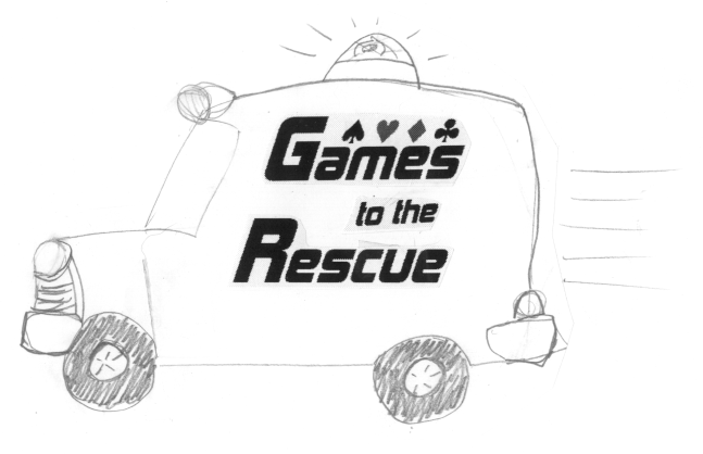
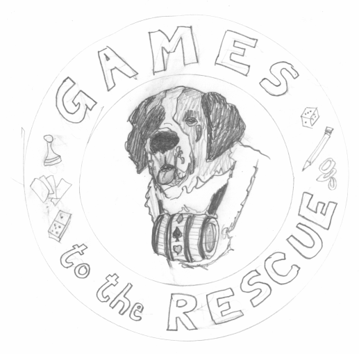
These are both sketches that Marty did a week or two ago. She did them as a surprise for me, so I scanned them in and uploaded them as a surprise for her. These are rough, folks; Marty does professional-looking logos when she takes the time to scan in her art and clean it up digitally.
First, a logo that riffs off the stuff other folks have done above. If we go with this, I think a non-standard red cross of some kind would be a nice addition:

Next, a sally at the St. Bernard logo idea we were kicking around on-list:

Alex, what was the "cartoony bit" you were talking about to go along with the text logo? Marty told me if you're interested, she would like to take a crack at it.
--Ron_Hale-Evans?
I really like them both. Nice job, Marty! I think I especially like the St. Bernard though. He looks so friendly!
--Meredith_Hale?